Vol. 1, No. 8
- - - - - - - - - - - - - - - - - - - - - - - - - - - - - - - - - - - - - - - - - - - - - - - - In this issue:
reviews of JLA: Classified #11 and Astonishing X-Men #12 / notes on GØDLAND #2, Manhunter’s gleeful geekiness, the Marvel-CrossGen rivalry, Marz and Cheung’s Scion, Young Avengers #6, Amanda Conner’s Love and...er...Rockets, my essential X-Men, and would’ya believe...even more?! / rants about what the ^%$*# happened to Jim Roeg?
- - - - - - - - - - - - - - - - - - - - - - - - - - - - - - - - - - - - - - - - - - - - - - - -
reviews
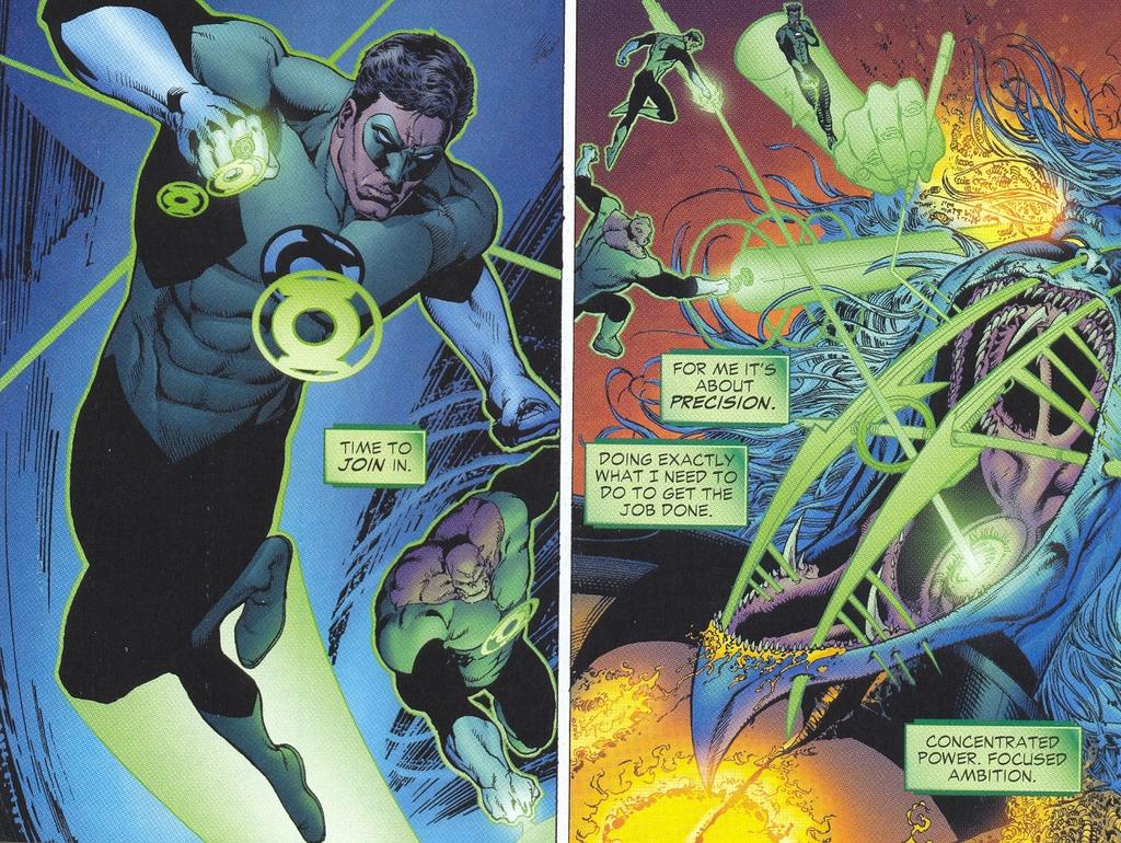
JLA: Classified #11 (DC Comics)
Warren Ellis (Writer) / Butch Guice (Artist) / David Baron (Colorist) / Phil Balsman (Letterer) How do you know that Warren Ellis and Butch Guice are good? Because nothing happens in JLA: Classified #11. And it’s still fantastic.
Yes, Ellis is clearly “writing for the trade.” In fact, given the meager degree of story advancement in this issue, it could literally have been a 6-page back-up. Be that as it may, this story exemplifies the affective power that “American-style” decompressed storytelling can wield in the hands of a talented creative team.
In a marvelous article comparing Big Two decompression to Manga storytelling techniques, using House of M and Battle Royale as examples, Mark Fossen argues that mainstream “American” comics often fail to excite because “creators from the Big Two have aped the form and structure of decompression without understanding the true content.” House of M, he continues, mistakes the mere extension of the time of narration for an intensification of the story’s emotional impact—an impact that Manga typically achieves through an intense focus on expressive character reactions. And yet, although Mark is critical of House of M in the article, he is careful to point out that American techniques (borrowed from film) are not inherently inferior:
Apart from a few notable exceptions like Kevin Maguire, American comic artists take much of their cues from the often emotionless faces found in Hollywood film. It’s a naturalist tradition that usually calls for underplaying the emotion while the director is using other tricks (editing, music, camera motion) to provide the emotional content. Mainstream American comics art emphasizes composition, dynamism, and storytelling but gives short shrift to any emotions outside the heat of combat. It’s not necessarily the poorer for it, anymore than Death Of A Salesman is poorer than Hamlet. It’s just coming from different traditions, and uses different techniques to get at an artistic truth.This is a sharp observation, and I’d propose that JLA: Classified #11 is a particularly successful example of this “American” technique where emotional power does not reside in the characters’ reactions but in the vectors of movement their bodies create.
 The emotions this issue elicits are elemental in their simplicity: they are akin to the joy or euphoria created by a roller coaster ride—and I mean this comparison very literally because the entire issue is organized around extremes of speed and movement, especially vertical movement: the lift-off, the plunge.
What would it feel like to be Superman? To be Wonder Woman? To be Flash? The entire point of this issue is to answer those questions through the metaphor of movement—extreme dynamic shifts that we can relate to, but which exceed our experience. The most incredible sequence in this regard is on pages 12-14.
On page 12, Superman buzzes the Mythos Exhibition of Curt Swan and Julie Schwartz’s work, seeming almost to emerge right out of it (nice touch), and lifts off, heading up, up, and away.
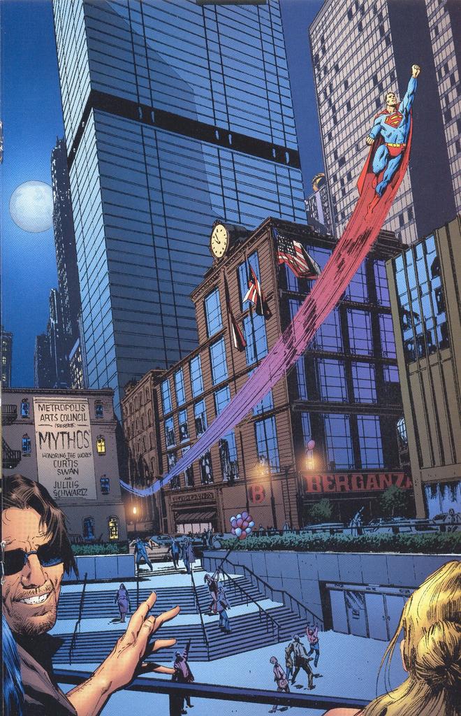 I love the smallness of Superman on this page, the way the buildings still dwarf him. Most Superman artists draw him in midrange shots or close-ups where he commands the whole panel. Guice’s long-shot conveys what is startling about the idea of a man who can fly: he is one of us, not larger than life, and this makes his flight more astounding, not less. The depth of the square in the middle ground (accentuated by the people in the foreground, surrogates for the viewer) contributes to the illusion, the ascending stairs perfectly balancing Superman’s upward arc, making him seem that much lighter. As he pulls away from the earth, the earth itself seems to bend in the opposite direction: two ends of a wishbone. This page is a précis of the issue’s aesthetic strategies in two ways. One: make Superman small, like us, small enough that we can hitch a ride on his coattails, almost imagine what it would be like to soar. Two: accentuate the vertical. Extremes of height and depth. These will be the language through which “superpowers” will be translated into experiences our bodies almost recognize.
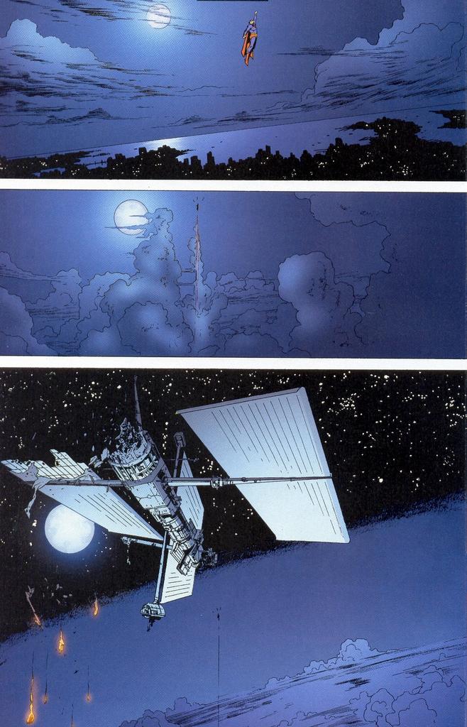 These are not two strategies, but one, and it is repeated again and again: on pages 1-3 Themyscira is falling out of the sky and Diana is rising up to meet it; on page 5 Wally West becomes Flash in a series of vertical slashes; and on pages 13-14, Superman’s higher and higher flight straight up into space is suddenly reversed by Diana’s backward plunge in the ocean’s depths. This surprising, dizzying reversal literally made me catch my breath.
If an issue is going to have as little plot as this one, it had better be brimming with affect—and this one is. It’s pure adrenaline. And the pulse-quickening excitement doesn’t come simply from Guice’s fantastic use of space and movement, but from the repetitions themselves. The visual repetitions I’ve already mentioned, but also the repetitions inherent in Ellis’s script: both the fact that all the heroes discover the same black sheet covered with phosphorescent green characters and the terrific repetition of the ending, which is stagy, but thrilling all the same:
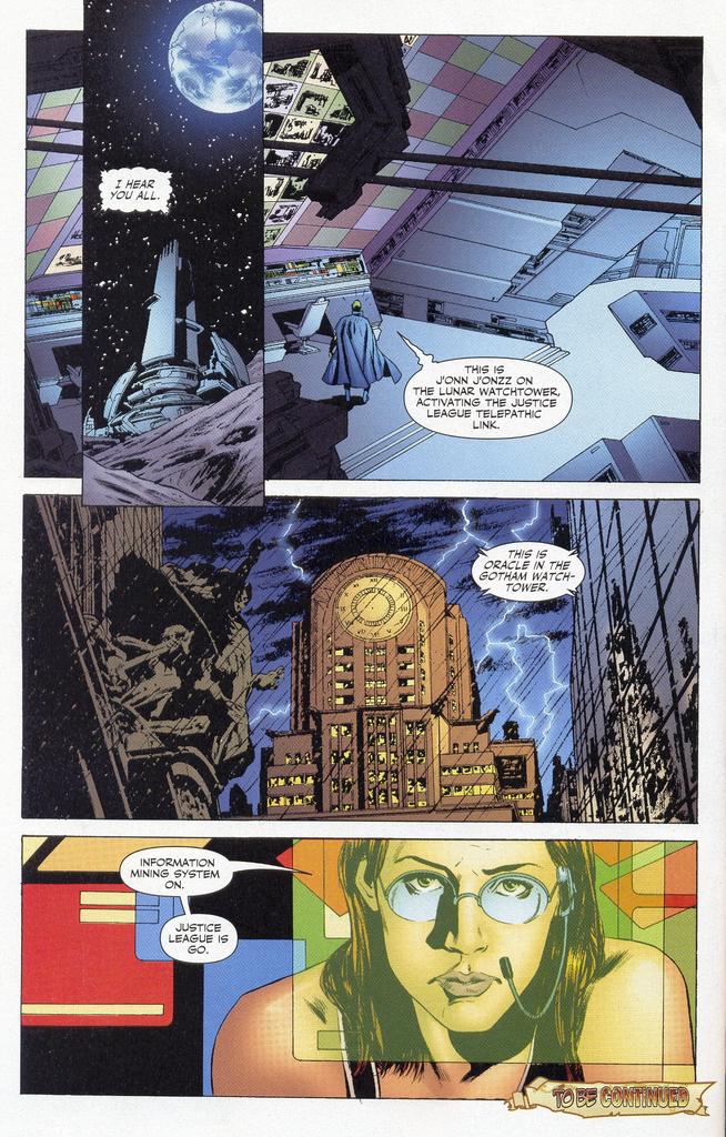 Superman: J’onn, can you hear me?
Diana: J’onn, this is Wonder Woman. I need a consultation.
Kyle: J’onn, this is Green Lantern. I could use some extra brains here.
J’onn: I hear you all. This is J’onn J’onzz on the Lunar Watchtower activating the Justice League telepathic link.
Barbara: This is Oracle in the Gotham Watchtower. Information mining system on. Justice Leage is go.
These repetitions are a perfect condensation of a thousand similar scenes in which the heroes get set to head out and do their thing. Sure we've seen this fetishization of beginnings before, and yes, it’s hokey as hell, but how often is it presented so stylishly? J’onn’s activating the Justice League telepathic link? Alright! Oracle just turned the Information mining system on? I don’t know what that is...but awesome! Justice League is go? You’d better believe it!! hrm.
If you like superheroes, buy this book.
Astonishing X-Men #12 (Marvel)
Joss Whedon (Writer) / John Cassaday (Artist) / Laura Martin (Colorist) / Chris Eliopoulos (Letterer)
 I hate it when reformed villains revert to type.
 The wonderful thing about villains and villainesses who reform is that the almost inevitable result is a complex and fascinating character. To begin bad but seek the good is perhaps not quite the universal human condition we might wish, but it certainly is a powerful metaphor for the ethical struggle that most human beings wage within themselves from a very early age between selfish desires and social responsibility. Grant Morrison knew this, which is why Emma Frost was the breakout character of his New X-Men. The subtle variation on this—the pure villain who, every so often, does some tiny nice thing, is possibly even more wonderful, and more true. (For some reason, this rule does not seem to apply to Magneto, who is always boring, except when played by Ian McKellan.)
The other permutations of this scenario are rarely as satisfying, though some come close. When a hero violates some ethical code of heroism but still remains basically good, the effect is again added depth, but the feeling it produces is the melancholy of realism (Zatanna) rather than the euphoric tension of epic, where heroism in the social sense is so often underpinned by selfishness and a yearning for glory (Beowulf).
The even simpler scenario, in which a would-be hero is suddenly revealed as a traitor is thrilling in a different way, and the feeling it produces is again different: something closer to the weird catharsis of certain kinds of tragedy where the so-called “tragic hero” doesn’t have something as dainty as a “fatal flaw” but is a pathetic villain whose sheer audacity commands our attention, if not our sympathy (Shakespeare’s Macbeth, or Wolfman and Perez’s Terra).
 Taken alone, any of these scenarios is thrilling, and maybe I’m just an aesthetic fascist about some things (no maybe about it, actually), but I really don’t savor that moment when they’re thrown together in a pot and combined into a fourth story where the reformed villain slides back into the pit, or is revealed to have never “really” reformed at all. The reason I don’t like this kind of villain/hero/Judas story structure is purely selfish, even childish: it’s not a satisfying wish-fulfillment, but a depressing reality-check. I’m already well aware that real-life “heroism,” more often than not, has a Judas-face. So it is particularly irritating to have a story about the wobbly heroism of a morally complex, multilayered character suddenly reduced to the black and white simplicity of a traitor story. Pure traitors are fine, because our identification with such characters takes a different form than our identification with the villain-turned-edgy hero. The former are admirable only in the most abstract existential terms (we “admire” Macbeth because he never gives up, even though he knows that his own death is inevitable), whereas our involvement with nearly reformed villains like Catman and Emma Frost is far more immediate and visceral. (Which isn’t to say that we don’t “identify” with more conventional heroes as well, but that’s a different, very complicated issue for another day.)
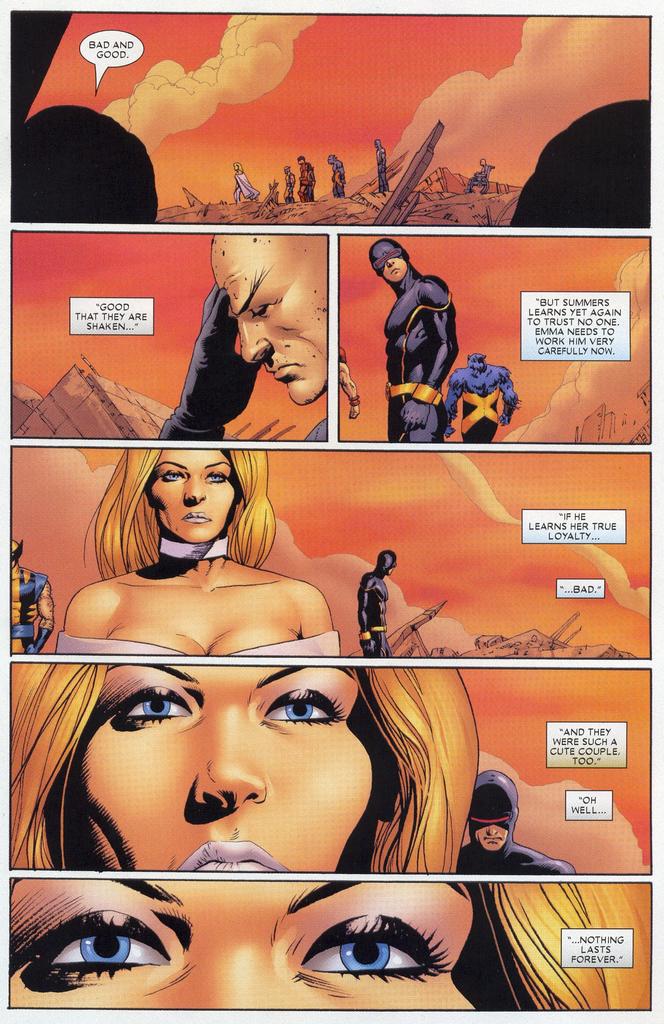
So, did I hate the reveal in Astonishing X-Men #12?
I did not. But only because I trust Joss Whedon to be teasing us like crazy. Whedon knows soap opera and he understands the value of a good sucker punch. He knows that the best way to keep viewers interested is to figure out what they hold sacred and then to rip it away from them cruelly, with extreme prejudice—or, at least, to seem to...
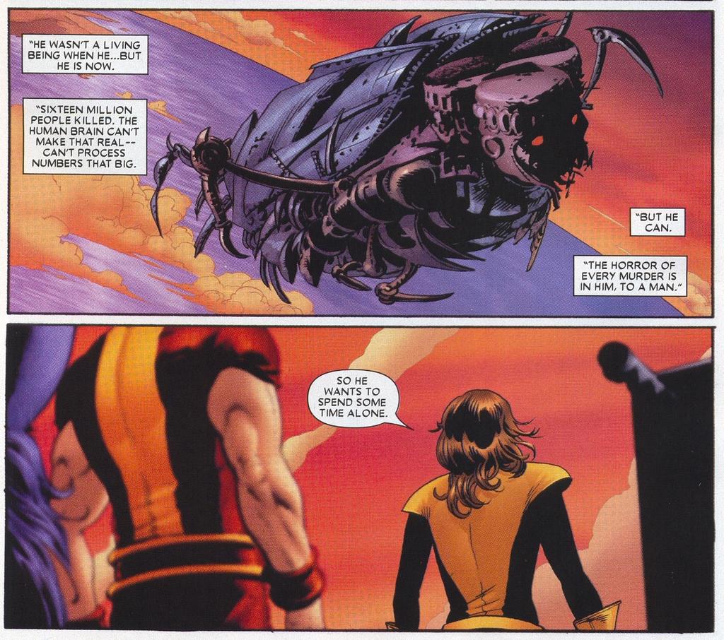 I’m not worried about Emma and Scott. Things are about to get really good on that front. I also really liked the departure of the mega-Sentinel into space in this issue. Lovely. What I did not like was the preposterous retconing of Xavier into a moronic hypocrite. Let’s hope that Whedon and company have a few unplayed cards up their sleeves that will redeem this clunker of a plot point.
notes
Splash-Page of the Week: GØDLAND #2
 My back-ordered copy of GØDLAND #2 finally arrived last week—and it was worth the wait. Holy Moley. That’s the kind of punch I want from my funny-book pictures.
 In the unlikely event that you haven’t been lured into checking out the complete first issue of this heady series, now online at Newsarama, here’s the link. And here’s an accompanying interview with the artist, Tom Scioli.
As for GØDLAND #2? I can do no better than to quote Matthew Sweet: 100% Fun.
Low Blow of the Week: Wha…HUH? #1
 You can’t say that Mark Alessi didn’t ask for it, considering all the smack he talked about Marvel back in the day. And yet, there’s something not quite on about big-kid Marvel scoring points off a company that’s not only smaller, but DEFUNCT! Careful guys. You know what they say about school yard bullies...
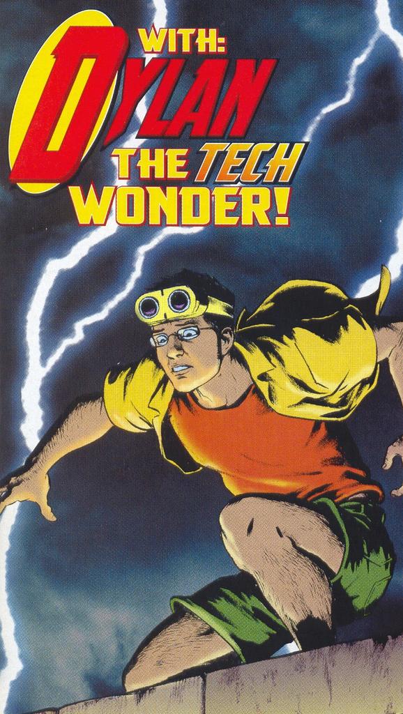
Geek All-Stars: Manhunter’s Dylan
 Who says that DC is pandering to the aging base of thirty-something fanboys that help keep this goofy medium afloat? Huh? Who says??
Random Young Avengers Thoughts: TV Comics Are Better Than Movie Comics, or Welcome to the Y.A., Bitch!
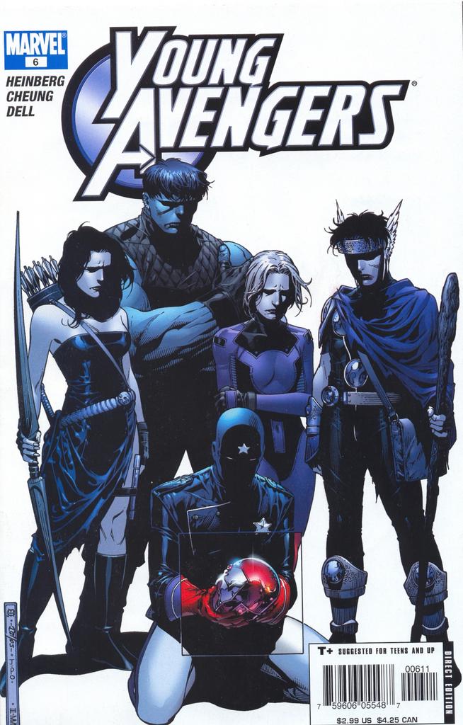 Young Avengers rocks. It’s the smartest, hippest, slickest, wittiest, funnest, most relevant comic Marvel is currently publishing. In fact, it is the only comic Marvel publishes that answers to this particular combination of epithets. I was going to write a lengthy review of Young Avengers #1-6, praising the series to high heaven in my usual tendentious and hyperbolic way. But I ran out of steam. And anyway, Mark Fossen and Michael Pullmann have already said it all and said it eloquently.
  So here’s a half-baked, completely undeveloped idea instead: O.C. writer/producer Allan Heinberg’s Young Avengers demonstrates that comics based on TV-storytelling techniques are superior to comics based on movie-storytelling techniques. Or: more TV serial-style comics (which are denser and faster-moving, even if they do take six issues to tell a story) might save us from the plodding excesses of weak “decompression.” Take it, leave it, run with it; it’s yours.
Creative Team-Up of the Month: Amanda Conner and Power Girl
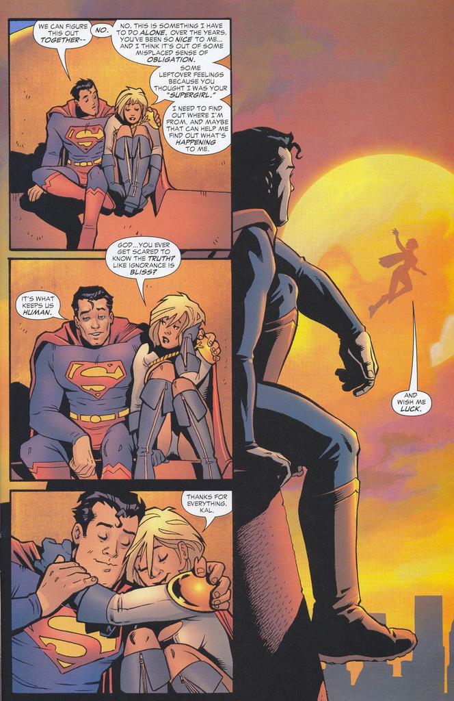
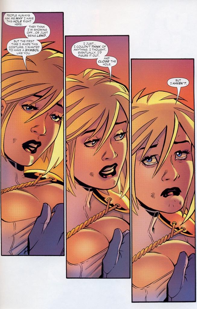 How do you make Power Girl a credible and interesting character? First, you put her in the JSA and get Geoff to wave his magic retcon wand, transforming the peek-a-boo hole in her costume into a meaningful bit of characterization. (The scene on page 19 of JSA: Classified #2 is a nifty bit of symbolic thinking because it discovers depth precisely where there seemed before to be only shallowness.)
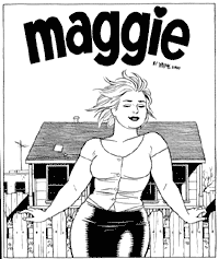
To really make this girl (and this reimagining) fly, however, you bring in an artist whose style transcends cheesecake, transforming the protagonist into someone who feels like the real woman inhabiting this body. You find an artist who can do visually what Johns does narratively. You hire Amanda Conner.
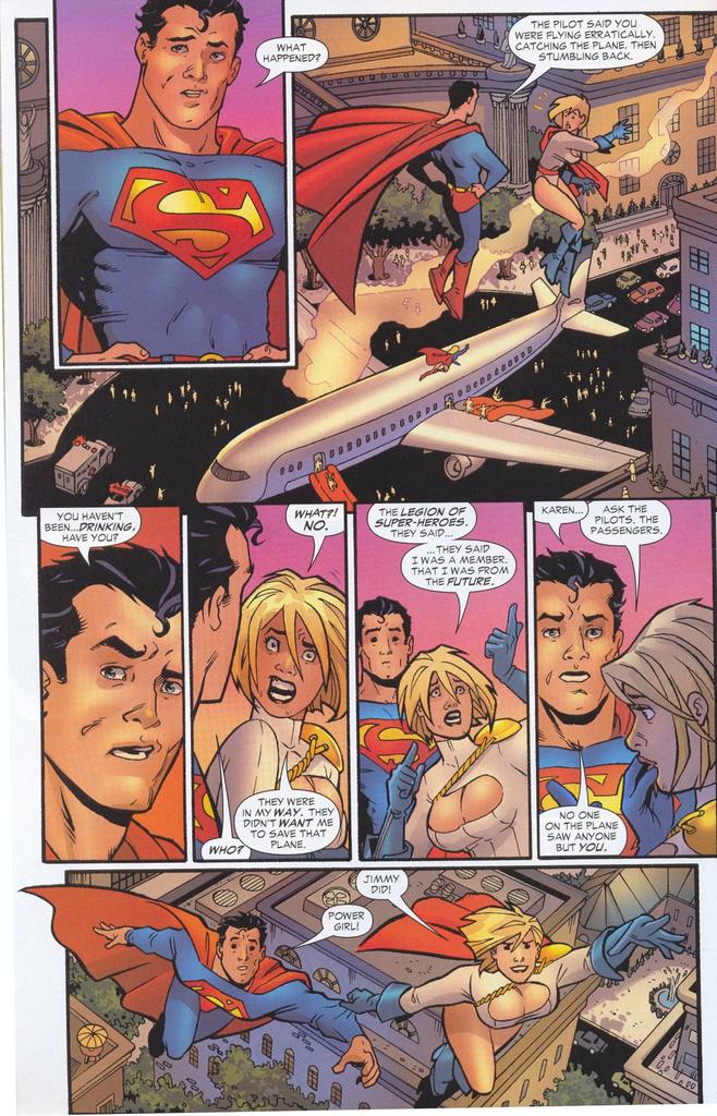
 What’s so special about Conner’s art? It’s more expressive than most mainstream superhero art. It conveys intense emotion through bursts of cartoony body language. She draws great energetic superhero action, but her style sometimes reminds me of Jaime Hernandez. Like Jaime’s, her subtle Archie comix faces are infused with tragedy and realism, and her Power Girl is specifically reminiscent of Jaime’s Maggie: beautiful, big, funny, vulnerable. She breaks your heart at least three times an issue. Is it just a coincidence that this story about Superman’s poor-relation (a would-be refugee from Krypton) could almost have been subtitled: Love and Rockets?
My Essential X-Men, Vol. 6
 Marvel’s Essential X-Men series has finally caught up with my period of true X-devotion. Volumes 4 and 5 included many of the first Claremont X-Men stories I read: the Dave Cockrum/Paul Smith illustrated Brood Saga with Carol Danvers as Binary was the first (#162-66), followed by “Professor Xavier is a Jerk!” (one of the best X-Men stories ever—with one of the best cliffhangers too). The grimy battles with Callisto's crew in the Morlock tunnels and Barry Windsor Smith’s classic Life/Death issues were also early favorites. But Volume 6 begins almost exactly where I really got serious about this book. By issue #199, I was no longer a casual buyer, but a genuine fan who never missed an issue—despite the fact that I was never entirely sure what was going on.
 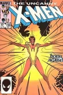 In 1985, I was 13—old enough, certainly, to follow the plot when I tried. But keeping track of Claremont’s Byzantine subplots and innumerable supporting characters involved actual work, and as I’ve already established, I was (and still am) the laziest of readers. I remember hurting my brain trying to figure out how Rachel Summers could be Cyclops’s daughter, but that was a rare instance. Usually I just didn’t try that hard to understand. I liked the mystery. At that time, the pleasure of Uncanny X-Men was not the pleasure of narrative, but the fragmentary pleasure of reading in blocks that I’ve written about before, and that no doubt reminded me of those earlier experiences of childhood reading where one is nestled between confusion and understanding.
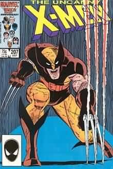
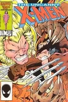
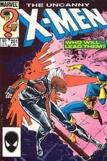 The really wonderful thing about Claremont’s X-Men was that those sections of the book that did hang together as narrative blocks really were jewels. These issues are simply packed with memorable scenes: Charles passing the torch to Magneto in the garden because he thinks he’s dying (#200), Storm vs. Cyclops for leadership of the X-Men (#201), Logan’s brutal issue-length scrap with Rachel (#207), Colossus killing Riptide and a hardcore Storm leaving the “remaining Marauders” to Wolverine as the Mutant Massacre kicks into overdrive (# 211). These scenes of operatic mayhem were truly special, and they stood out in part because they were offset by a background that was both hazy and dense.
 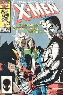 There was always so much pedestrian “business” in X-Men—the trial of Magneto and the behind-the-scenes machinations of Mystique’s Freedom Force being particularly typical examples. I found these (often issue-long) background stories unreadable, and, in fact, I often skipped over them for the fight scenes. Nonetheless, the boring bits were integral to the experience of the X-Men in those days: they gave the emotionally overwrought battles I loved a feeling of weightiness and import. In short, they made the book feel sophisticated and adult precisely because they were over my head. Claremont’s wonderful obscurantism pushed back the feeling of readerly competence that would come with adulthood a few years at least.
These are classic stories, and reading them now is in many ways a different experience than reading them then because—surprise, surprise—they really are coherent narratives after all. And good ones at that. But even just flipping through this collection is a treat; it may only be black and white, but the art is excellent. This was a great period for John Romita Jr.—his lines are fluid and free, and there’s a compositional daring to his panel layouts that still really grabs me. (I did a comic book project for a junior high class around this time in which I basically plagiarized panels from a variety of Marvel comics, several of which were Romita Jr. ones included here, like the time-lapse image of Valerie Cooper plotting at the bottom of page 6 from issue #199.)
 The collection also features art by such masters as Art Adams, Barry Windsor Smith, Walt Simonson, Jackson (soon-to-be “Butch”) Guice and Kyle Baker, and Alan Davis. The complete unpredictability of the art from issue-to-issue was also something I loved about this period of X-Men—which is strange, because I hated fill-in artists on any other book. Clearly, the quality of the fill-ins here was generally exceptional, but there was also something about the constantly shifting art team that made this period of Claremont’s X-Men feel “cosmopolitan.” It also distinguished it from my favorite book, the New Teen Titans, which was marked by the consistency of George Perez’s pencils. The opposite approaches to art on Marvel and DC’s rival bestsellers made them even more complementary than they might have been had X-Men had a stable art team. This complementarity ultimately balanced the scales, making these two books so fundamentally different that they were difficult to compare.
 In terms of size, Essential X-Men, Vol. 6 is a massive phonebook of a collection, taking readers from the trial of Magneto right through the Mutant Massacre to the introduction of Psylocke. It also includes the X-Factor and New Mutants crossover books from the Mutant Massacre, as well as the other ones that I never bothered buying at the time: Thor and Power Pack. And it gives us the Asgardian adventure from New Mutants Special Edition #1 and X-Men Annual #9, both gorgeously illustrated by Art Adams (whose work still looks tremendous in black and white). Marvel’s spotty Visionaries trades could learn a thing or two from the generosity of Essentials compilations like this one.
Now, if only they would get cracking on Essential New Mutants.
Make Mine Mae Mai!
 Jon Silpayamanant is not only running an outstanding blog of comics and cultural criticism called Mae Mai, where he brings an exceptional range of erudition to the analysis of comics and visual art, he’s also a hell of a generous thinker. (You’ve probably seen his name in the comments section of more than one blog, including this one.) Jon describes Mae Mai as “Comics, Orientalism, Culture and Imperialism, Comparative Neurolinguistics, and Performance Theory.” All I can say is, anyone who can bring Edward Said and W. J. T. Mitchell to bear on comics in such illuminating ways is someone everyone interested in comics criticism should be reading. Religiously.
My Ever-Shrinking Bank Account
 Ian has a great piece at Brill Building that explains why I’m such a Johns junkie: it turns out he’s one of my favorite Marvel writers, Steve Englehart, in disguise! I know what I’m buying tomorrow. That, and the Essentials collection of Steve Gerber’s Howard the Duck, thanks to this fantastic set of posts at Nobody Laughs At Mister Fish. I won’t have time to read them, but that’s another story (see Rant, below).
The CrossGen Chronicles (Part 2): Scion #13-14

 A medieval world with lightsabers and genetically engineered “Lesser Races.” Warring kingdoms: Raven and Heron. A murdered monarch. A treacherous son. A golden haired hero on a mission of vengeance. A beautiful, good-hearted princess from a corrupt kingdom. A mysterious “Underground” where the Lesser Races plot their freedom. And among them all walk godlike beings with agendas of their own…
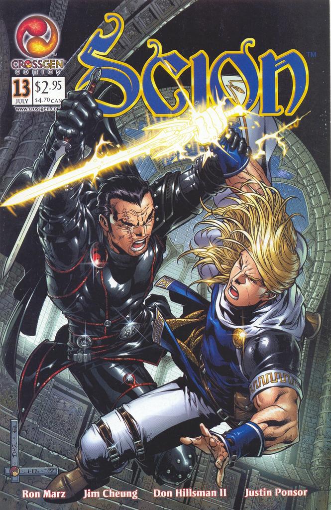
 Everything about Ron Marz and Jim Cheung’s Scion felt familiar. Star-crossed Heron prince Ethan and Raven princess Ashleigh were essentially riffs on Shakespeare’s famous teen lovers, played as Luke Skywalker and Dana Scully in buckled tunics and leather D&D-wear. And like many of CrossGen’s titles, it seems to have sprung directly from the genetically engineered brain of Joseph Campbell that Mark Alessi and head writer Barbara Kesel kept on ice in the basement of the company’s famed (now infamous) Tampa studio. The story was self-consciously archetypal and basically conservative. Reading it was like curling up in a warm blanket on a cold day. Neither particularly challenging nor profound, it was nonetheless a comforting and beautifully-illustrated fantasy.
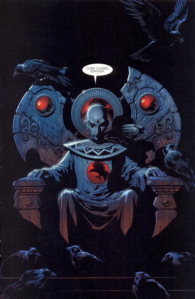 Issues #13 and #14 were the first ones I read. I bought them together off the rack the week after discovering Crux. And though I found the medieval-SF concept vaguely appealing, the real reason I bought these issues was the art by Jim Cheung (pencils) and Don Hillsman II (inks), and especially the gorgeous coloring of Justin Ponsor. Cheung was still honing his craft in these issues, but they contain some truly exquisite sequences, and it’s really something to see how quickly his work develops from the earliest issues of Scion (which I read later in trade form) to these ones, and then to compare the drawings in these issues with his current work on Young Avengers.
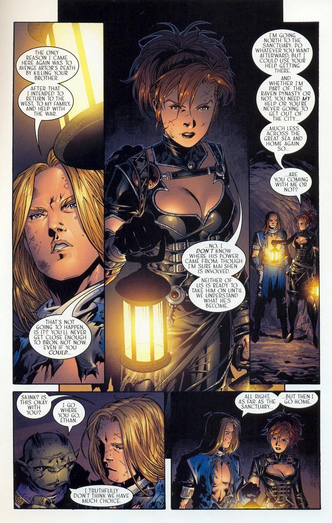
  Two scenes from this pair of issues really stood out as I thumbed through the comics in the store. Ashleigh’s nightmare about her brother’s regicide/patricide on pages 1-3 of issue #13 and Ashleigh and Ethan’s flight through the underground tunnels to the sanctuary at the end of issue #14. They are both chiaroscuro scenes lit only by lamplight or (seemingly) blood.
 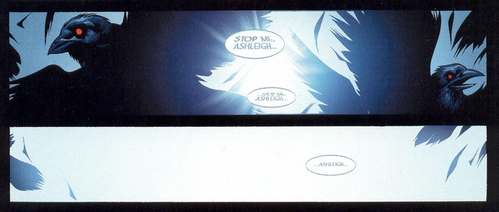 Unfortunately, the feeling these scenes convey visually is more disturbing and weighty than the series itself ultimately manages to be—clearly because it was consciously designed with a junior high school readership in mind (as part of CrossGen’s educational “Bridges” program). These scenes stand out because they convey a potential that was not realizable within the narrative constraints of the CrossGen universe (by which I do not mean their overarching continuity-driven mega-story, but the corporate calculations of things like the Bridges program which—at least as I understand it—effectively consigned certain titles within a single overarching story to never surpassing a certain “level” of reader sophistication. There was an annoying contradiction here that resulted from CrossGen trying to be all things to all readers, and having books like Scion pull double duty as both feeders for younger audiences and bricks within the larger story which had more sophisticated themes, story elements, and ambitions.
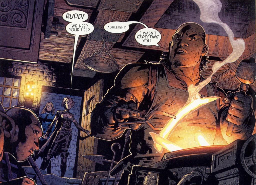 So, although I enjoyed this book, I often found myself wondering what might have been had Marz really cut loose and aimed higher, unencumbered by CrossGen’s corporate master plan. Scion was good, sometimes very good. With an art and writing team as extraordinary as this one, however, Scion could have been something far richer and deeper than it ultimately became. What Marz and Cheung’s archetype-driven Scion turned out to be, ironically, was the archetypal CrossGen book in the sense that it encapsulated both the strengths (incredibly talented and creative people) and the weaknesses (a built in set of narrative limits and restrictions) of CrossGen’s entire line—at least in its first two years.
 For more on Scion, see Chris Fluit’s excellent review of the entire series at Captain Comics, which charts the high and low points of Ethan and Ashleigh’s adventures. James Meeley has also been thinking about the strengths and weaknesses of CrossGen lately in this excellent post where, like yours truly, he laments what might have been...
rants
What the ^%$*# Happened to Jim Roeg?
I’ve been asking myself the same question. I’m over a week late with Spoilers Abound, I haven’t posted a new essay in weeks, and I’ve dropped the ball on several really interesting conversations taking place on other blogs. Heck, I haven’t even made it to the comic store yet this week!
Ah, September.
As anyone else out there who works in education knows, September is a vortex. No matter how prepared you think you are for the new school year, it always takes you by surprise, and it’s always more overwhelming than you remember.
In light of this, and as readers of Near Mint Heroes already know, I’m going to be taking a very brief sabbatical from Double Articulation for the next month or so to devote 100% of my energies to the work that actually keeps me in comics, sandwiches, and clean socks. You haven’t gotten rid of me for good though. I’ll be back with new essays, commentary, and all the usual self-indulgent nonsense that you’ve come to expect from this site in mid-October. I’ve got three more essays on love in comics mapped out, as well as other essays planned on the perfection of David Anthony Kraft’s Defenders, Biblical allusions in a beloved issue of the old (good) Marvel Team-Up, commodities and capitalism in The Spectre, and the seductions of fascism in the barely-remembered Super-Villain Team-Up. Probably something on my strange relationship with epic-fantasy as well, but only if I’m feeling punitive.
In the meantime, enjoy the archives, if you haven’t had a chance to check them out already and if you have a tolerance for ponderous, sentimental recollections. Before I sign off: a big thank you to Ian, Peter, Mark, and Jog for the nice attention and for sending a few more readers in this direction. Thanks a lot guys! Now that I’m slowing things down here for a bit, I’m hoping to finally catch up on your and everyone else’s blogs. (Did I say 100% of my energies will be going towards work? Make that 99.9%. You’d be amazed how much goofing off I can cram into 0.01%.)
Thanks everyone for reading and for your thoughtful comments and replies; it’s been an incredibly fun and educational summer for me. See you back here in October, and of course, around the blogverse in the meantime.
Jim