Vol. 2, No. 8
- - - - - - - - - - - - - - - - - - - - - - - - - - - - - - - - - - - - - - - - - - - - - - - - In this issue:
reviews of Justice League of America #1 and Batman #656 / notes on Spider-Man Loves Mary Jane, J.G. Jones, my new favorite novel, Dame Darcy, Penguin's 'Toon Covers, Bazooka Joe, the summer's best superhero flick, and the Bat Guys / rants about new books in need of CPR
- - - - - - - - - - - - - - - - - - - - - - - - - - - - - - - - - - - - - - - - - - - - - - - -
reviews
Justice League of America #1 (DC Comics)
Brad Meltzer (Writer) / Ed Benes (Penciller) / Sandra Hope (Inker) / Alex Sinclair (Colorist) / Rob Leigh (Letterer)
Now THAT is what you call a tour de force. From the bouncy and dead-on characterizations of the issue-long summit between DC’s superheroic trinity to the heart-squeezing final page, Brad Melzer’s Justice League of America #1 gets it right.
There have been several great incarnations of the League over the years. Giffen & DeMattheis’s Blue and Gold cut-ups and Morrison’s cosmic oddities were by far the best of the recent revamps (hat-tip to Mark Waid for his inspired Tower of Babel story), and if this issue is any indication, Meltzer’s league will easily step into the company of those great eras. It will do so, however, in a very interesting way.
Both the Giffen/DeMattheis- and Morrison-era Leagues drew on the past, but understood themselves as fairly drastic reinventions of the JLA. And in both cases, the changes involved a hyper-stylized modulation of tone—gonzo humor in the case of G&D, “wonder” in the case of Morrison. In fact, their tonal distinctiveness made both books, even at their most satisfyingly conventional and nostalgic, still felt more like auteur projects than typical mainstream fare (much like a Woody Allen film or Bendis’s New Avengers, where it is impossible to forget, even if you try very, very hard, the hand of the writer at work). Meltzer of course brings considerable baggage to the JLA following his controversial Identity Crisis series (which, for the record, I enjoyed), and the distinctive quality of his dialogue, pacing, and plotting will no doubt give his Justice League run a bit of that auteur quality as well. But in this case, and unlike his predecessors, Meltzer’s League combines a fresh sensibility with a more profound return to basics in both character and story.

Hence the prominence of Red Tornado in issue #1. Why does Meltzer begin with him? Because, in addition to his tantalizingly enigmatic connection to the original Crisis, Red Tornado is now the most iconic member of the original JLA. Unless I’m forgetting some important history, Giffen, DeMattheis, and Morrison all but ignored the character, and the simple fact of his absence from the most high-profile League relaunches in recent memory has made him into a sort of relic in whom the older tales of the original Justice League of America could be nostalgically and uncannily embodied. The fact that Red Tornado has an android body and is thus in a certain sense a “blank” or “empty” signifier just waiting to be filled enhances the uncanny effect of this embodiment. Who (What?) better to act as a placeholder for a previous era of comic book adventures than an artificial hero? The ultimate metafictional character for a superhero universe. I’m pushing my luck, as always, but I can’t help speculating that Meltzer was in some manner attracted to the Red Tornado character for this reason, and had something like this in mind when he made “Reddy’s” (apparent) shift from a synthetic to a human body the subject of the first issue of his Justice League of America. In any event, whether he did or not, issue #1 still presents us with an incredible metaphor for Meltzer’s new League: an artificial man of the past who takes on flesh (“I’m sweating and tasting!”) is the ideal analog for how Meltzer breathes life into old genre clichés, without ever giving up on the pleasures and satisfactions that classic genre storytelling provide. Indeed, the Red Tornado’s extensive history of destruction and rebirth is also an ideal metaphor for the Justice League of America itself—both the team and the comic book. A fitting and engrossing first issue.
Batman #656 (DC Comics)
Grant Morrison (Writer) / Andy Kubert (Penciller) / Jesse Delperdang (Inker) / Dave Stewart (Colorist) / Nick J. Napolitano (Letter)
Isn’t it nice to read a fun Batman comic? The first issue of Morrison and Kubert’s run got off to a bumpy start with its Joker-in-the-trash shtick, but by this issue, everything’s roses, er…ninja Man-Bats. This review could rapidly descend into raptures about Morrison’s witty and ingenious Litchtenstein tribute, which gleefully announces, in ever more amusing ways, Morrison’s intention to travesty Batman’s Dark Knight image and restore a sense of frivolity, colour, and LIFE to this character. The gallery’s upside-down dinosaur in formaldehyde—a wry echo of the big green dinosaur “trophy” in the Bat Cave and presumably the work of provocateur Damien Hirst—is the symbolic centerpiece of Morrison’s vision of the new Batman, who, like the Green Dinosaur, is finally out of the Bat Cave, upside-down, and in a bright, madcap postmodern setting.
Batman’s hilarious battle-cry, “If there’s one thing I hate…it’s art with no content!” manages to be simulataneously an ironic wink at the absurdity of ninja Man-Bats (art with no content writ large!), an ironic nod to the lighter tone of the book, and an apt comment on the difference between a Roy Lichtenstein exercise in form and the comic book medium itself (art with content because, unlike the decontextualized and amusing but alienating Lichtenstein panels, it has an involving narrative). But wait—I said that this review could rapidly descend into raptures of this sort, so before things degenerate any further, let me just offer two observations about what makes this series such a welcome and diverting breath of fresh air.
First, thank goodness for Morrison’s efforts to humanize Batman through the renewed focus on Bruce Wayne. Focusing on Wayne’s playboy alter-ego is the most obvious way in which Morrison frees Batman from the more neurotic (if not psychotic) recent iterations of his masked persona: by spending considerable panel-time showing Wayne as a pleasure-seeker (even if it is to a large extent an act), Morrison effectively dispels the repressed, pleasure-denying Wayne that has implicitly driven the grim Batman persona of the past twenty years. The daring choice to explore the taboo idea of a Bat-Son is the logical extension of this new focus on the sexually freer “hairy-chested love god” version of Batman that Morrison has proclaimed his interest in reviving. More subtly (or perhaps less subtly), Morrison heightens his humanization of Batman by shifting unexpectedly between the Batman and Bruce Wayne identities mid-battle: for example, when Batman compares the Man-Bats (“six hundred pounds of meat, gristle and hide”) to Aunt Agatha’s overcooked Thanksgiving turkey.

This is unexpected identity-shift provides a great cheap-laugh, but it also erodes the distinction between Batman and the free-spirited Wayne-identity to make Batman himself more human and less dour.
Significantly, such a renewed focus on the hero’s civilian alter-ego characterizes DC’s new approach to Wonder Woman and Superman too. Historically, Superman has had the strongest relationship to his civilian identity, and, beyond his “blue Boy Scout” persona, it is perhaps for this reason that the character has often sustained a sense of lightness and fun more effectively than either Wonder Woman or Batman. Across the board, DC’s strategy for reinvigorating its Holy Trinity has been to humanize them through a focus on their civilian personas (Diana’s new job over in the superb new Wonder Woman series and the Clark Kent-focused “Up, Up, and Away” and “Metropolis stories” over in the Super-titles). In this regard, Morrison’s Batman is emblematic of the welcome new tone that has taken root in the post-Crisis DCU. The bottom line is that this is new territory and it feels damn exciting, in large part because the increasingly humanized characters now offer much stronger points of fantasy-identification, even as they hold out the possibility of narrative growth and change for the characters themselves. All while fulfilling the genre expectations of high-adventure superheroics in spades, er…ninja Man-Bats.
Contributing to this radical change in the feel of the Batman book is Andy Kubert and Jesse Delerdang’s art, which is, on its own terms, wonderful. Morrison gives them incredible things to draw of course—things that make the book’s visuals recall the Batman Family era when gangsters in a darkened museum plunged at Batman from the balcony on hang gliders (or were they kites?) painted with glorious Chinese designs. The pop art gallery is a throwback to that much older period of Batman gallery fights and Kubert has great fun updating it. More generally, though, the pairing of Morrison (the guru of retro-“newness”) with Kubert is a genius editorial move. That’s because, despite his past work for DC, Kubert is one of the industry’s most recognizable “Marvel” artists, and the added frisson of having an iconic DC character drawn by a dynamic Marvel artist reinforces the sense of a radical and refreshing change at a whole other level, drawing on fans’ awareness of industry politics in a most ingenious and satisfying manner. Historically, the difference between DC and Marvel characters has usually been characterized as the difference between Gods and humans; how clever of the new DC to poach an artist from that other camp to give their newly humanized stable of iconic heroes a humanistic shot in the arm.

notes
Trying New Things: Spider-Man Loves Mary Jane
I always mean to try new things and I always enjoy others’ recommendations, but for some reason I have trouble actually taking the plunge. I must have been feeling impulsive last week because I picked up a copy of the Spider-Man Loves Mary Jane Marvel Digest (collecting issues #1-5 of the series) on the strength of a recommendation that Richard made awhile back here in the comments section of DA. All I can say is, I’m glad I tried it—I haven’t smiled so much or laughed out loud so many times while reading a comic in a long time. Sean McKeever’s script is intelligent and hilarious—a dead-on portrayal of the yearning, pain, and excitement of high school romance. Like all readers who read Manga for the first time, I feel compelled to register my shock and amazement at the subtlety and depth of human emotion conveyed by Takeshi Miyazawa’s witty, absorbing, and often touching art. This kind of confession is obnoxious, I know. Forgive my ignorance. I love this book. Thanks, Richard!
J.G. Jonesing
You all know about J. G. Jones’s 52 cover blog hosted by Wizard, right?
If You Like This Blog, You Might Enjoy...The Mezzanine
Friends, you know I sometimes exaggerate. That I sometimes get carried away with enthusiasm. This is not one of those times. I have recently been introduced to a slim novel called The Mezannine by Nicholson Baker. My friends: buy, borrow, or steal this book. NOW. It is the most jaw-droppingly beautiful-hilarious-poignant-true Proustian ode to everyday life that I have ever read. It will make you squirm with recognition and want to sing with melancholy joy—joy that someone else really is as neurotic as you are and really sees and experiences all these banal/profound things too. The premise of the book is simple (a man who works in an office takes his lunch break), but the execution is utterly dazzling. Baker is a master-stylist. Listen to this sentence in which the protagonists reflects on learning to tie his shoes: “Only a few weeks after I learned the basic skill, my father helped me to my second major advance, when he demonstrated thoroughness by showing me how to tighten the rungs of the shoelaces one by one, beginning down at the toe and working up, hooking an index finger under each X, so that by the time you reached the top you were rewarded with surprising lengths of lace to use in tying the knot, and at the same time your foot felt tightly papoosed and alert.” Tightly papoosed and alert. That’s writing. And, I submit, that’s how it feels to read The Mezzanine. Baker spends pages explaining the historic shift from paper to plastic drinking straws, recounting the Byzantine etiquette of office chit chat, rhapsodizing about the “black” Penguin Classics, philosophizing about what it feels like to run out of staples. And it’s all poetry. Oh…here. Just read it.
Reader, I drew her: Dame Darcy’s Jane Eyre
Dame Darcy’s Victorian nightmare Meatcake is one of underground comics’ most savory, slithery pleasures. And there could not be a more ideal artist to adapt Charlotte Bronte’s gothic treasure, Jane Eyre. Forget Jane and Rochester; Charlotte and Dame Darcy are the perfect couple.
Penguin Classics Deluxe Editions
These gorgeous new Penguin editions with covers by many legendary comic artists and cartoonists are old news now, but they were new to me when a colleague of mine—one Hulk Hogan (no relation)—drew my attention to Frank Miller’s recent cover for a new edition of Gravity’s Rainbow. For a complete set of cover scans (including a brilliant Candide cover by Chris Ware and a sumptuous Sadean cover by Tomer Hanuka), see these posts at nifty book blog The Millions.
Everydude: The New Bazooka Joe
How do you make geriatric scamp and gum-cartoon star Bazooka Joe hip again? According to market research, you turn him into Ashton Kutcher. How do you package him for global consumption? Diversify the cast! For all the details on Joe’s new look and new posse, check out thisamusing New Yorker report. Meet his new gang at the official Topps website. And while you’re at it, why not relive some Bazooka Joe classics? My homage to Bazooka Joe:

My wife’s comment: “It’s really funny that it doesn’t make any sense.”
My comment: “But it sort of does make sense, y'see it... it... Never mind.”
Sigh.
Recently Viewed: Years after everyone else, I've finally discovered Parkour!
District B13 – All you cool kids know this already, but the best superhero movie of the summer isn’t Superman, and it sure isn’t X3. It’s Pierre Morel’s graceful and exhilarating and very French Parkour actioner from 2004 that I managed to catch at a local rep. cinema after missing it when it played for all of one week at the big multiplex. Richard Schickel, in his suitably glowing review of the film for Time Magazine, hits the nail on the head when he says that “The French thriller District B13 makes everything Hollywood has lately done in the action genre look clumsy, dull and stale. It is a short, nonstop stuntfest that, by going back to basics and placing them on the screen with simple, breathless stylishness, turns what is essentially a lowlife movie form into something one is not embarrassed to call ‘pure’ cinema--all energy, movement and high kinetic wit.” “Lowlife” seems a little snobby, Mr. Schickel, but I heartily agree! Moreover, it isn’t just the action genre that is raised to poetic hights here. Martial artist Cyril Raffaelli (the good cop) and Parkour-god David Belle (the reluctant partner) are essentially superheroes, out-maneuvering and out-doing even the sublime, computer-generated Spider-Man films precisely because their “stunts” (an ugly, leaden word for what they do) are not performed in the zero-gravity of cyberspace. I hear that the new Bond will battle a Parkour-practicing terrorist (Sebastien Foucan) in the upcoming film. I guess someone’s paying attention. Watch the trailer here.
Don’t Tell Alfred…
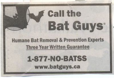
From my local newspaper. It amused. Was it the invitation? The concept of “humane bat removal”? The idea that there are “bat removal and prevention experts”? Naw…it was that second “S” in NO-BATSS—just to make it scary! Three cheers for...the Bat Guys!

rants
DC Sentences You to Death...By a Thousand Fill-In Artists
Last week I expressed my annoyance over the clunky relaunch of The Flash and my dismay over the parade of guest-artists on barely-begun Shadowpact. Last week, the new issue of The Flash seemed to combine both of these gripes in an all-new, all-weird way: Karl Kerschel and Serge LaPointe’s stunning guest-art on issue #3 is a cruel act for regular penciller Ken Lashley to follow on a series that has already had such a rough start. To this list of puzzling new-series foibles and fumbles, I also now have to add the latest issue of Blue Beetle (a title I just got through praising), which features…yet another fill-in artist. I have very fond memories of Cynthia Martin’s ultra-pretty work on the old Marvel Star Wars series, but having her attempt to emulate the indie style of “regular” series penciller Cully Hamner is sort of the worst of both worlds because no one is fooled by the imitation and it curtails Martin’s naturally smoother, more beautiful style. Hamner’s Blue Beetle work is fantastic, but he’s now drawn only 3 of the first 6 issues of the new series, which is lame by anyone’s standards. DC is producing the most exciting books in the business right now, but what is the point of launching a new title if you are not going to set it on a solid creative footing? The writing on Blue Beetle and Shadowpact is excellent, but the art is inconsistent and these titles feel amateurish as a result. The problem with raising the bar, as DC has unquestionably done, is that fans’ expectations rise with it. Come on, DC. Get these titles on track, or they won’t last a year.


