Monday, November 27, 2006

Kirby’s Best Character Design: The Thing

Better late than never, right Sean? I can’t tell you how tempted I was by King Solomon’s Frogs, but in the end, I have to agree with plok and go with Ben Grimm. This will come as no surprise, I’m sure, since I’ve waxed poetic about the pathos, profundity, and—heck yeah—perfection of Kirby’s great existential hero before.

The idea of a creature composed of living rock is one of humankind’s oldest myths, but Kirby gives this myth its most viscerally human embodiment with one brilliant design feature: the brow. Yes, the orange rocks are essential, but it is the craggy brow shading Ben’s mournful baby-blues that creates a visual metaphor of the character’s extreme vulnerability and gives this pop version of Frankenstein’s Monster the true spark of life. And let’s not forget that Ben Grimm’s connection to Mary Shelley’s monstrous Adam (or is that Eve? or Satan?) extends beyond a visual referencing of the Boris Karloff movie version: Shelley’s original alienated Monster is, in many ways, the existentialist precursor to Grimm as well.

Additionally exciting, I think, is the way the Thing design so successfully sublimates Kirby’s primitivism. The astonishing modernist vitality that Kirby cannot help imparting to everything he draws achieves something unique here: in contrast to his more overtly thematized designs, the Thing is a truly modern primitive, and this means that he uncannily embodies an emotional intensity that (politically incorrect though it now is) modernist art routinely associated with “pre-modern” cultures. The Thing’s living rocky hide makes him a humanized version of the “primitive art” that was in many ways at the heart of Kirby’s own style. That Kirby himself was a stout figure gives Ben Grimm the additional savour of a self-portrait.

The real shame is that Marvel seems unable to imagine a meaningful place for its most adult character in its current universe. Is it a coincidence that the Thing left the FF just as Civil War began? I don’t think so; perhaps he found the whole debacle as depressing as I do. May his exile at least be short-lived.

Wednesday, November 22, 2006

Lost Objects 3: What Was It?


Law of the Father? Fetishism? My Castration Complex?

Sunday, November 12, 2006

Double Articulation Digest #2

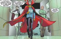
Doctor Strange: The Oath #1-2 – There’s still time. If you hesitated about buying the first issue because the cover logo was so inexplicably ugly, it’s probably not too late to reconsider. My advice? Just suck it up and take the plunge. Yes, the logo is hideous; but if you turn the page quickly, you’ll forget it in no time. Brian K. Vaughan and Marcos Martin are outdoing themselves in this witty, beautiful story, which is by far the most assured and entertaining Doctor Strange tale I’ve read in many years. Vaughan’s wry take on the Stephen Strange/Wong relationship is perfection, and so is his use of Florence Nightingale fetishist Night Nurse, a salty structural stand-in for Clea who uses bobby pins instead of spells. Who says Marvel doesn’t know a thing or two about style?
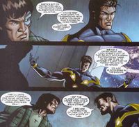
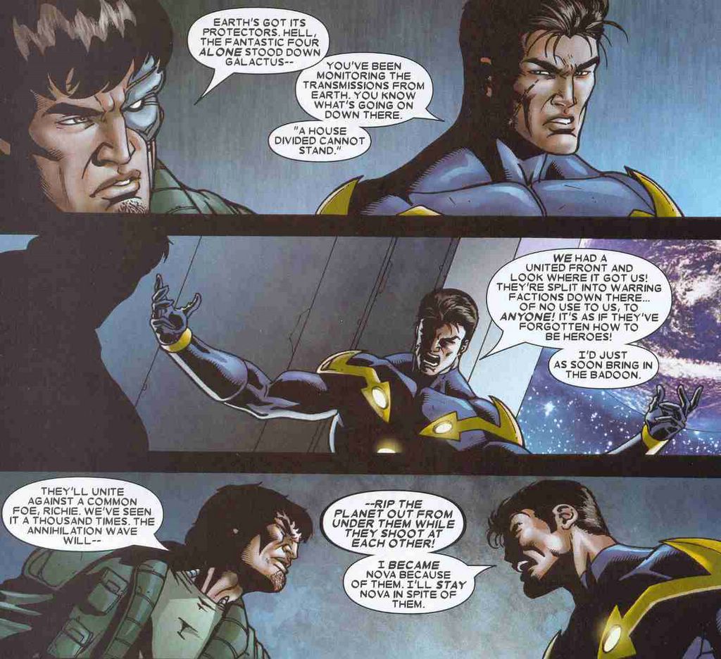
Annihilation #4 – The exciting twists and turns of this space saga are further evidence that Marvel needs to liberate both its writers and its fans from the creative quagmire of Civil War a.s.a.p. Annihilation is a “traditional” space saga—by which I mean, it has an entertaining story, appealing characters, and beautiful art. This issue contains some satisfying revelations about Annihilus’s plans and gives more airtime to one of my favorite second-string Avengers: Moondragon. Oh, and it features one titanic ass-kicking. The best issue so far of a series that is shaping up to be outstanding. If only the Marvel webmasters could succeed in matching the covers with their correct issue descriptions in their on-line catalog (the actual cover to this issue is here). While they’re at it, perhaps they could make the Marvel website legible. Even after its reorganization, it is still, hands down, the most unnavigable company site on the web.

52 #25,#26, and #27 – There’s no shortage of things to praise about 52, but one thing I’m especially enjoying is its revival of DC’s more freakish characters, as well as its invention of new ones. Oh, Grant Morrison.
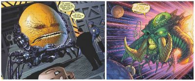

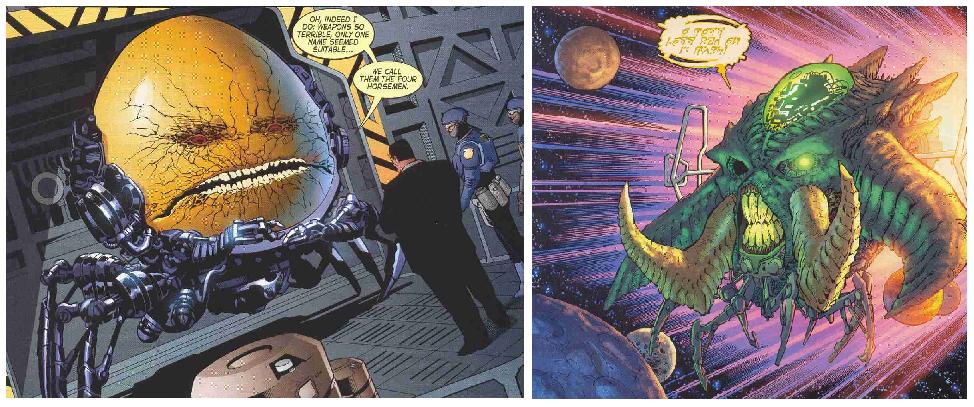
Is Chang Tzu “Egg Fu”? And more importantly, why do both he and Emerald Eyed Ekron have all those crazy robot legs?? (And who’s “driving” Ekron??? Or do my eyes deceive me?) Can we expect more disturbing monster-heads? 52 is so entertaining that someone is going to have to invent a special industry award just to honor it. Am also loving Ralph’s Orphic Odyssey. Not to mention the promised integration and rationalization of DC’s time-travel characters. Interesting too that the most recent issue appears to confirm my (and probably everyone’s) suspicion that the little girl on the cover of week 25 foreshadows of Renee Montoya’s future. R.I.P. Vic Sage; long live The Question.
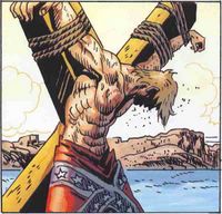
Jonah Hex #13 – The already unmissable series gets gussied up a little further as Justin Gray & Jimmy Palmiotti are joined by international comics artist Jordi Bernet to tell the origin of Jonah Hex. The story is gripping and the interior art every bit as rich and expressive as the superb cover image suggests. What a treat, for as good as this series has been, the charm of this issue is that it actually looks like classic Western comic. Highly recommended.

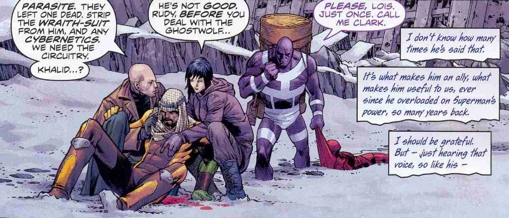
Superman #657 – This is turning into one of the best Superman stories ever told. Seriously. Busiek is on fire writing an apocalyptic future in which Superman’s own body becomes the missile that send the earth into a state of nuclear winter.
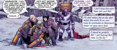

The apocalyptic future has long been a cliché of the superhero genre, but it feels different this time. The “superteam” of Luthor, Lois, Jimmy, and Parasite on the cover is...so cool. And Pacheco’s art…gasp! The cover. The two-page spread of Metropolis falling into the sea. Everything here is just so beautifully rendered. I have nothing intelligent to say about this except: more please!
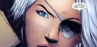
Teen Titans #40 – This was a good issue. But precisely because it was good, it also reveals the main limitations of the current series. When I finished reading it I thought: “Well, that was…moderately fun. It reminded me of some great stories from the past.” But, unfortunately, that’s about the most I could say about it. As my various Teen Titans posts over the past year and half have indicated, I’m tremendously ambivalent about this series, despite my nearly sycophantic admiration for Geoff Johns’s work on virtually every other title we writes, and despite (or perhaps because of) my fetish for the Titans era that Johns’s current series is attempting to emulate. I really like the One Year Later team; for the first time since the end of Wolfman’s brilliant Titans-Hunt saga, Johns has created a Titans team that could be spectacular. The group has energy, dynamism, and strikes a winning balance between novelty and tradition. And yet, despite a lot of action, globetrotting, new characters, and revelations, the actual story of this team still feels like it hasn’t started yet. I’m still asking myself, who are these characters? Who (especially) is Raven? And not in a gee-I-can’t-wait-to-find-out kind of way. More like an annoyed, wtf? kind of way. Similarly, the reveal at the end of this issue was enjoyable. But in a Johnsian universe, it was also inevitable (even though, I admit, I hadn’t predicted it). My complaint is that being caught by surprise this way can only be a mild thrill, and after awhile, begins to feel like a cheap trick if it isn’t supported by the kind of intricate character development and extended serio-comic “a day in the life…” downtime that was a hallmark of the classic New Teen Titans upon which so much of a reader’s enjoyment of the current series depends. What I don’t like about the current series, then, is its selective use of those Wolfman-Perez stories: it keeps much of their content, but throws out the form. What this new series has made me realize is that (nostalgia aside) my love of those earlier tales had as much to do with their formal density as with their treatment of plot and character. And of course, the two things are inseparable. Between Wolfman’s verbosity and Perez’s super-compressed, multi-panel pages, the classic New Teen Titans actually had room to deliver substantial doses of action and reflection every issue. The Johns/Daniel stories, however, are still too decompressed to do this adequately, so instead, they tend to build character development and reflection into their action sequences, sequences which are themselves simultaneously rushed (because there are too few panels per page) and overextended (because they take up so much of each issue). The result is a frenzied pace that never quite allows the team to gel. For an older fan like me, it all feels a little too much like the proverbial sound and fury… And yet, fulfillment is so close, you can almost taste it. Gah!

Saturday, November 04, 2006

Kryptonian Fathers, Kryptonian Sons


Action Comics #844 – I wasn’t sure about this at first, but now that I’ve adjusted my brain to recognize this as a Richard Donner Superman film in the form of a comic (not a regular DCU Superman book), I’m enchanted. The orphan’s fantasy of recovering the absent father that pervades the Donner films is the driving force here too as Superman intervenes in what appears to be his own story being played out a second time. This is a compelling premise because while Superman’s intervention in this issue brings his own position in the orphan/foster-father narrative full circle, it does so in a way that may allow him to heal the initial gap between himself and the ghost-father/Mighty Oz, Jor-El. By becoming the space-boy’s guardian, Superman consciously steps into the role of archetypally good foster-father, Pa Kent; yet, because he and the boy are (apparently) both Kryptonian, Superman potentially transcends the position of “alien” foster-father to symbolically recover the original absent father, Jor-El—that is, he recovers his own father by “becoming” a “real” Kryptonian father in relation to a “real” Kryptonian boy/self.

No doubt, complications will ensue to muck with the promise of such mythic fulfillments. But it’s a tantalizing premise all the same, and its pathos is enhanced by the “filmic” visuals supplied by Adam Kubert in this issue. By “filmic” I don’t mean “grand” or “panoramic,” but quite the opposite: strangely subdued, realistic, plain. The banal details of the lab make it feel ordinary. Superman hovers cross-legged talking with the boy as he eats a sandwich on plastic toy furniture. The cubicles at the Daily Planet where Lois is working late have an exceptional degree of cinematic vraisemblance. There are no “supervillains,” yet. Barely any powers. That’s why the action sequences feel heavy—rather like “special effects.” (Could the producers not afford a conceptual artist to design a convincing spaceship? Is that why the child is “delivered” to earth in a giant wheel of brie?)


But this isn’t a criticism. What I am describing is the “austerity” that Hollywood cinema brings to the superhero movie because budget constraints require a stingy and very deliberate parceling out of visual departures from everyday realism. Superpowers are expensive, which is why the movie-Superman and his spandex-clad fellows spend so much time acting as brooding metaphors in superhero cinema rather than tossing bad guys around. When this kind of situational austerity is transferred to comic books—usually in adaptations of superhero films—the effect is almost invariably ugly, boring, and depressing. (I don’t think I’ve ever read a comic book movie adaptation that I’ve liked. And of course, that’s partly because such things aren’t written for me anyway; the adaptation is a “mediating” genre written for film goers who don’t read comics, though it’s hard to imagine that they’d be convinced to try more by such labored introductions.) Here, however, the Johns/ Donner script and Kubert’s translation of the restraint and austerity that comes from Donner’s (and Johns’s) film background produces a deeply gratifying effect, perhaps because the story is not an adaptation and because the paring down of the “color” of the regular DC Universe in the pages of Action Comics gives the plot a melancholy and nostalgic feeling that fits.

And there’s something else too. In a story like this, whose main concerns are thematic (and not intrinsically tied to the superhero genre, even if they find in its tropes a particularly congenial form of expression), the shift from a comic book aesthetic of spectacle to a filmic aesthetic of superhero “realism” confers a significant advantage. Namely, the reduction of ordinary spectacle means that the moments in which “special effects” are employed resonate with unusual power. The image of the boy holding the entertainment unit over his head is extraordinary, but we’d barely notice it in an ordinary superhero book. The same is true for the remarkably evocative illustrations of Superman sitting with the boy as he eats his sandwich or talking over his case with the scientists while the boy lays asleep in the racecar-shaped bed. These images take us to the heart of an emotion that runs deep and is, I suspect, fundamental to Superman’s continuing appeal, particularly for men who can no longer lay claim to the territory of boyhood, despite their most ingenious and self-flattering efforts. That these images are set within a story about relationships between sons and fathers is not coincidental. The feeling they evoke is not one that I expected myself to be moved by, because it is almost too corny to name. But as I get older, it’s one that, increasingly, gives me pause. Especially when it is presented as delicately and earnestly as it is here.

Tuesday, October 31, 2006

On Halloween: Shrouded Skeletons and Friendly Ghosts

The covers of classic horror titles were often far superior to the “chilling, thrilling tales of mystery and suspense” they promised inside. Take this cover from Dell’s Ghost Stories #30 (1971), for instance, which I bought recently because it struck me with the force of archaic recognition.


Everything, everything that matters, is here. The greenish night. The house on the hill. The broken shutter. The bent and useless fences. The black claw of tree that reaches for the house and in the same moment frames it in the protective curve of its trunk. The spectral bat that frames it on the other side, flying us into the pinprick at the picture’s center: that eerily lighted room. (Look closely: it is a human figure.)

It is of course this room that has the broken shutter; like the house surrounded by broken fences, it must bear the signs of supernatural breach. Even these broken fences are doubled by the merely relative (and thus deceptive) frames of tree and bat whose ability to enclose depends on your point of view, as if you can never have too many signs of rupture.

And supervening all, the grey skeleton, veiled. Or is that “bed-sheeted”? A garment of ghostly mist that blankets the house, not so much framing as enveloping. Snugly and reassuringly. The garment of a grim Casper, an ultimately friendly ghost. A quaint spectre who “tucks us in.” A “familiar.”

For this is not an image of horror. Those images are different, and I would discover them in other places. (A coffee table book filled with giant color photographs of insects that I was afraid to touch. Pages swarming with ladybugs.) This is a picture of cozy transgression. It is “spooky,” not frightening.

No doubt, we could roll out the entire psychoanalytical machinery of Oedipus and the family to understand the domesticated “secret” of this skeleton in bed sheets. But must we? For me, the intensity of this painting resides not in the promise of unveiling, but rather in the satisfactions of deferment. Its signs of transgression are a ruse. The doubling, tripling of broken frames (shutter, fences, tree/bat) do not “disclose” the painting’s “secret.” They are the secret. It is literally an open secret, displayed on the surface. Like the pallid ghost stories behind the cover, the promised secret is too banal to read. (The stories inside have nothing to do with the cover—total detachment, infinite deferral; the revelation of the secret, what “only the ghost knows,” must be sought elsewhere, perpetually. A definition of pleasure.) This is a painting of the only true “secret”: the one that cannot be known. That yellow room. A pinprick.

In the end, this cover painting attracts me because it is an image of our profound delight in secrets. And this delight is condensed in the childhood bogey of the shrouded skeleton because—with its familiar, comforting bed-sheet and its only half-disclosed grinning skull—it is our most intimate, most reassuring signifier of the pleasures of secrecy. The keeper of a “chilling, thrilling” “mystery” whose solution is perpetually “in suspense.”

A friendly ghost.

Why I love Halloween.

__________
For more friendly ghosts, visit Keith Milford’s Old Haunts.

Sunday, October 29, 2006

Multiple Articulation: Links

Any Eventuality's Nobody examines the New Earth-Prime emerging from DC’s 52. And follow-up.

Chris Ware’s foldout history of intertextuality, Jonathan Lethem on Philip K. Dick, Steve Almond on James Frey, and more. (Thanks Thomas!)

Booby Kids. Panic Restaurant. Divine Divinity. 50 Worst Video Game Names Ever. Come for the names; stay for the biting sarcasm. (Thanks Dioscuri!)

With his usual wit and precision, Plok explains why Civil War falters at the level of storytelling and argues that we need to bring back thought balloons. I could NOT agree more.

Dave Campbell abuses the Nuclear Family, silly but beloved creations by Mike W. Barr and Jim Aparo.

Six-word Science Fiction Stories by Joss Whedon, Stan Lee, Alan Moore, Margaret Atwood, and many more. (Thanks again Thomas!) My contribution: Booby Kids. Panic Restaurant. Divine Divinity.

Anyone else want to play?

Saturday, October 28, 2006

Lost Objects 2: What Was It?


Walt Disney Uncle Scrooge #175 (1980)

Friday, October 27, 2006

On Comic Book Blog Names: Notes on a Subgenre

I was cleaning up my link list this evening and got to thinking about what makes for a good comic blog name. Aside from good old-fashioned geek wit, I mean.

Naming anything is difficult, but naming a living document like a newspaper, a magazine, or a blog is especially tricky. The function of a name is to individualize, yet, for documents whose content is constantly changing and evolving, the best names, perhaps, are those that paradoxically “individualize” in the most general, most inclusive way possible. Mark Fossen’s brilliantly named Focused Totality is the epitome of this individualizing-yet-inclusive paradox.

The implicit model upon which this and many other such blog names rely is the proper name. Billy, Sarah, Geordie, Ahmed, Frances: these names may have some cultural meanings, some vague connotations, even a specific tone, but they remain, in every way that matters, empty signifiers. Blog names modeled on the proper name may convey a kind of attitude or sensibility, but they can still be “filled” with any content whatsoever and will come, retrospectively, to stand for whatever fills them, no matter how contradictory or complex that content might become. Moreover, it is no doubt precisely the diaristic, open-ended quality of blog composition—the fact that, like the diary, it is a record of the unfolding of a life—that leads Blogger to have a registration field for “blog name” rather than “blog title.”

Of course, because we are talking about a specific subgenre of blogs, the titles frequently (though certainly not inevitably) allude in some way to comic books or to fan culture more generally. Sometimes the “allusions” are very direct, other times they are subtle to the point of imperceptibility, and together these types form two ends of a spectrum upon which most comic book blog names can be found. Running parallel to this spectrum is an array of names that make no allusion to comics—a fact which produces a curiously pleasing effect of displacement when you begin reading them.

Naming one’s blog is obviously a very personal thing because it amounts, in a strange way, to an extension of its author’s proper name, regardless of whether they use a pseudonym or not. I am therefore hesitant to offer any opinions at all about what others named their blogs (an presumption which feels a little like complimenting people on having chosen a nice name for their child, as if that was any of one’s business anyway). Nonetheless, here I go... I hope that no one will be offended if I at least offer up a few of my favorites. My bias in favor of blog names that reflect the “half empty-half full” principle of the proper name and make some sort of reference to comic book culture at some point on the scale of allusion mentioned above will be evident in what follows.

Dave’s Long Box - The name of David Campbell’s blog is my favorite example of the proper name/metablog hybrid. The individualizing function of the proper name is obvious, but what I especially like is the elegant triple-threat of “long box,” which simultaneously suggests comics, the blog itself (which functions as a sort of second-order electronic comic long box; hence, “metablog”), and (?) a crude pun that perfectly captures the swagger of Dave’s sharp and wickedly funny take-downs of his favorite “bad” comics.

Shane Bailey’s Near-Mint Heroes has a name as good as that of any comics magazine on the stands. I love the modesty of “Near,” even as I enjoy the crispness of “Mint”—a combination which perfectly describes Shane’s site. A great balance of individualization and generality, set within a specific allusion to comic collecting.

Dial B for Blog - Robby Reed’s masterful blog also has one of the most impressive examples of a name that seamlessly merges its two media: comics and internet. It does so, moreover, with extra panache because the Dial H for Hero concept upon which it plays was itself a book that broke the barrier between comics and their readership (readers wrote in with character ideas that then appeared in the comic) just as Robby’s site does. It’s a meta-metablog. Wait, I'm getting dizzy...

When Fangirls Attack! - in the grand tradition of other great “attack” titles like Howling Curmudgeons, Ragnell and kalinara come up with a name that makes me happy every time I read it. At once playful and serious in its feminism, it is ingeniously meta and yet, at the same time, brilliant in its simplicity.

Ye Olde Comick Booke Blogge - this one almost goes too far, but I really do love it. I want to say that it’s because the weird overlay of a new technology with archaism actually captures something very clever about the “global village” nature of ye blogosphere, but I think that, deep down, it’s just that all those extra “Olde Englishe” letters are really funny.

Tales to Mildly Astonish - like “Near” Mint Heroes, this blog’s name is a nice blend of self-deprecating irony and confidence, expressed within a comic book allusion. I like this kind of name, I think, because it pin-points the duality of comic blogs in general—that “who, me?”/“wait, listen to this!” quality of a public journal.

Although my favorites are all names that sit somewhere on the more obvious side of the continuum of comic book allusions, and since my own blog name falls largely outside this spectrum, here are a few honorable mentions of the more subtle sort that I admire for a variety of different reasons: Progressive Ruin (a fitting tribute to all of our addictions to seriality), Written World (possibly the best example of a sophisticated and resonant use of plain style), Pretty Fakes (this one needs a whole essay to explain its nuances; in fact, I think Prof. Fury may have written one!), A Trout in the Milk (Thoreau!), and last but not least, Crisis/Boring Change (possibly the most evocative of this type, and a Pavement lyric, if memory serves).

A number of this latter group are not exclusively comic book blogs, so the more general name choice no doubt follows directly from the broadness of the subject matter they treat. But the especially nice thing about these kinds of more general names is that when the blogs in question do write about comics, the names begin to acquire connotations and a richness they wouldn’t otherwise have. The restraint, even austerity, of some of these names, is pleasing in itself. But it’s that resonance—between the name and the content—that sticks in memory and makes the name hum.

Tuesday, October 24, 2006

Lost Objects 1: What Was It?


Walt Disney Uncle Scrooge #111 (1974)

Sunday, October 22, 2006

The New Double Articulation: More Slapdash! Less Content! Fewer Pictures!

Alas, my vain quest for perfection has smashed up against the granite wall of sleeplessness and overwork. As fellow-sufferers know, perfectionism’s an all-or-nothing game. Either you make it good, or you pack up your toys and go home. (We never learned to play well with other children.) The relative lack of posts lately has been a result of that deluded worship of exacting standards that I never managed to hit anyway. Now that I’ve been forced to admit to myself that there really aren’t enough hours in the day to do everything I’d like in precisely the way that I’d like, I’m rethinking my approach to the site in order to make it a little more sustainable over the long term. All of that verbose noodling that some of you kindly and over-generously mistook for “insight” and “quality” on this site? Gone! Forever! In its place: epigrams, maxims, gnomic wisdom.

If only, huh? Actually, not much will change. Major reviews will be self-contained, the “essays” will be shorter (probably a good thing anyway), and R.I.P. Spoilers Abound, at least for now. In its place? Read on. (Double Articulation Digest #1, below.)

The most obvious change is the new, less murky, hopefully easier to read Blogger template. I've had a few requests from nearly blind readers to give their eyes a break, and frankly, the blue template was starting to depress me. Hopefully this is a step in the right direction. A baby step. (A retooled link list will be back in the sidebar soon.)

JR